
Lead UX Researcher & Designer
Figma, Wix, Dedoose, Zoom, Excel
2022
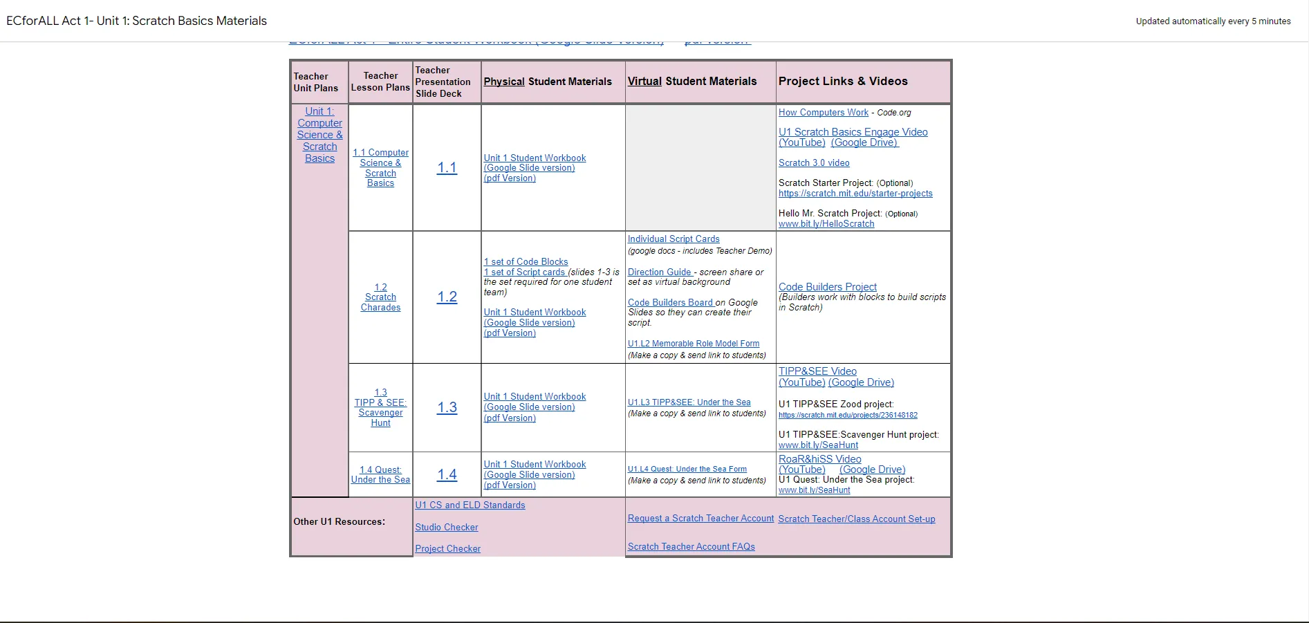
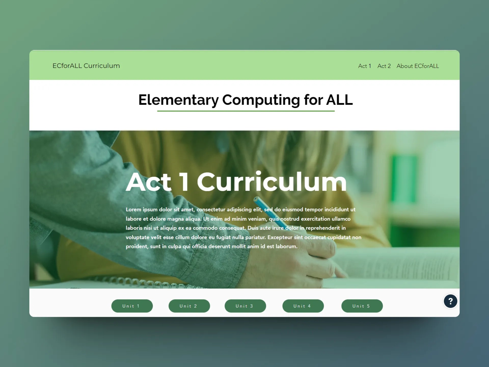
The Digital Learning Lab has developed and launched a weekly Scratch-based curriculum among a local school district for novice instructors to teach computational thinking to over 250 fourth grade students. Despite its current success, the website displaying the curriculum was met with multiple teacher requests for an improved layout that could help them navigate the dense amounts of scaffolding material in a fast-paced classroom environment, since the teachers often found themselves unable to find resources in time and struggling to assist the students.
Redesign the curriculum website to optimize the curriculum's resources by creating accessible breakdowns of each unit and highlighting the most critical components in each overview. Ultimately empower teachers to focus more time on interacting and assisting students, rather than navigating the wide breadth of information.
ECforALL is the main project of the Digital Learning Lab at the University of California, Irvine that focuses on developing and implementing a weekly Scratch-based curriculum for multilingual and socioeconomically diverse elementary students to learn computational thinking.
The curriculum has helped over 250 4th grade students learn foundational coding skills, as well as train teachers with no prior experience to teach this curriculum
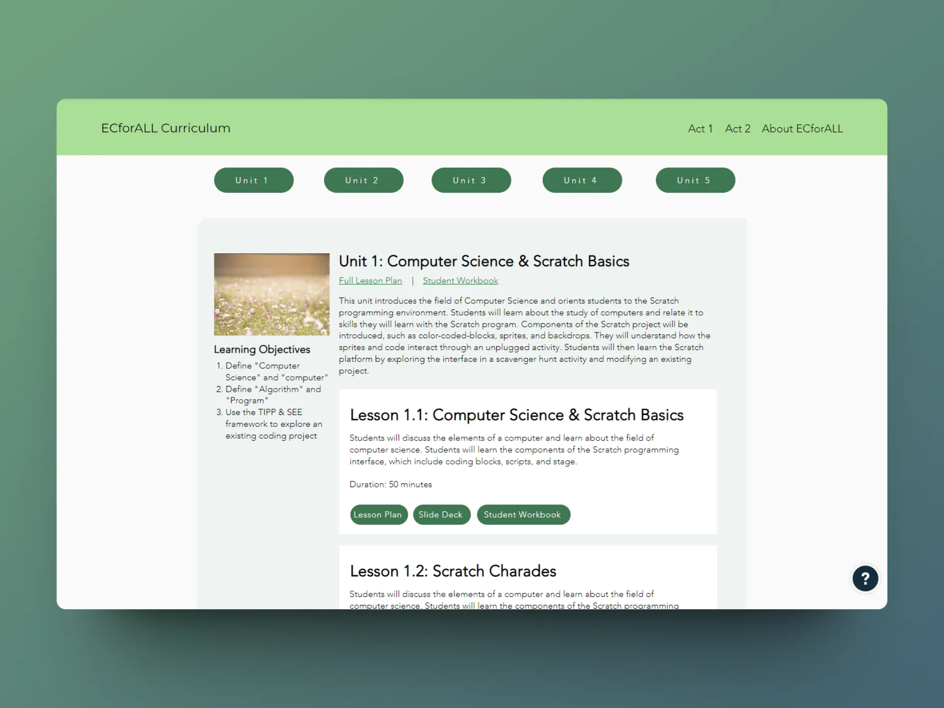
Despite the high-quality resources developed, the teachers reported struggling to use the cluttered interface, especially within fast-paced classrooms that required them to find resources immediately to assist students

How might we help teachers optimize the curriculum's resources during preparation and in-class instruction, so they can focus more time on interacting and assisting students?
Since the project had already been deployed for several years, I first conducted primary and secondary research to understand their protocols and basic curriculum implementation.
.webp)
I also began attending weekly stakeholder meetings with the rest of the lab. This would help me not only understand the holistic scope of the ECforALL project and what direction the research team wanted to head in, but also...
Hear directly from teachers (the users) about their prior experiences
Collaboratively brainstorm and decide on priorities of new interface
Present design iterations to ensure all parties were updated on a weekly basis
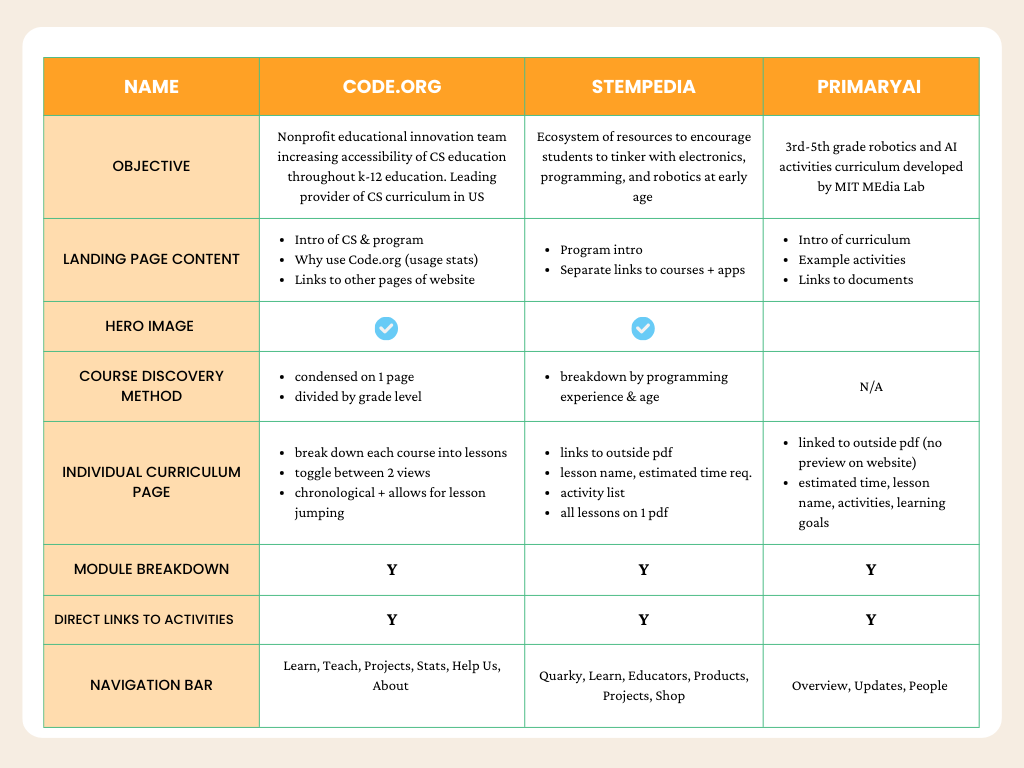
Compared the top 3 CS e-curriculums in the country to identify key features and analyze the way their pedagogy is displayed.
.webp)
.png)
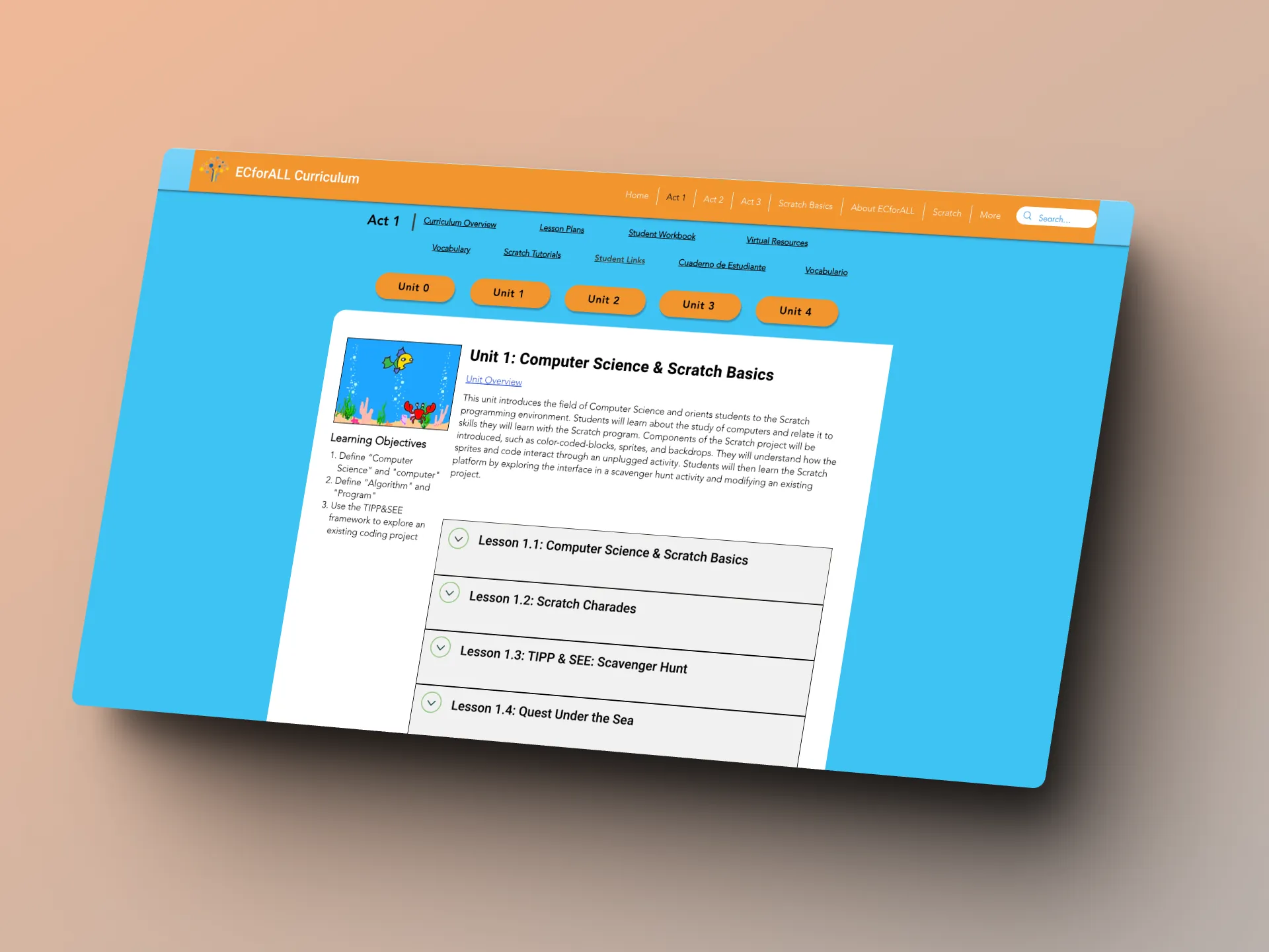
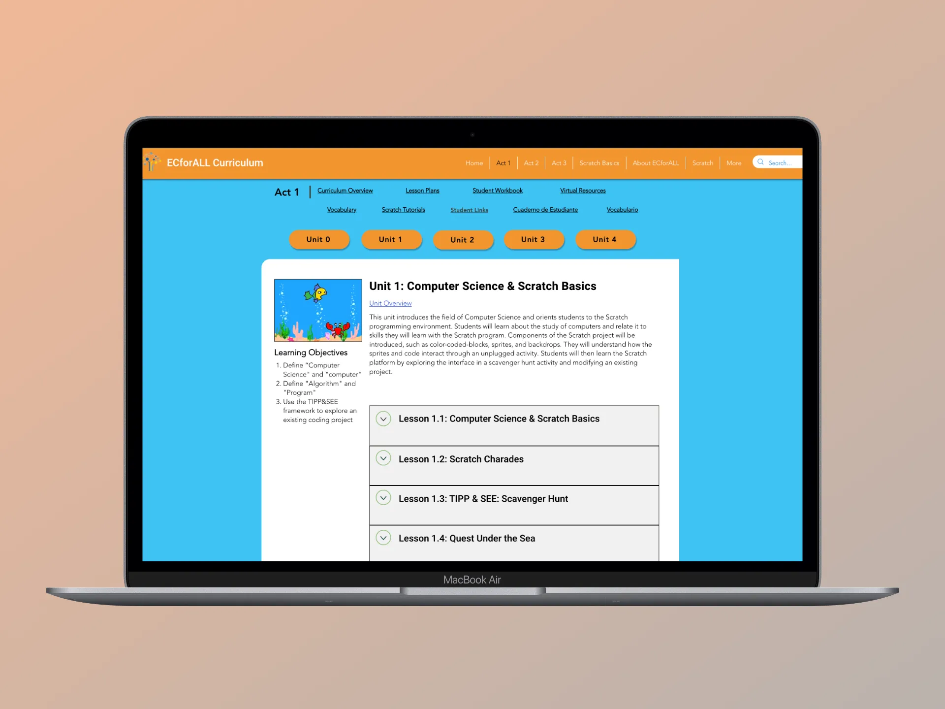
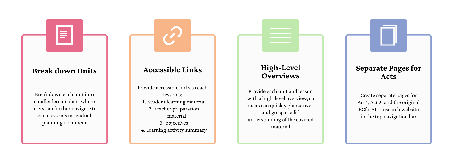
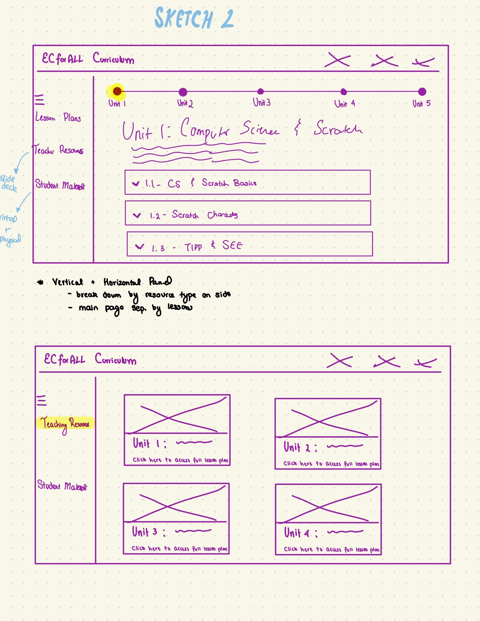
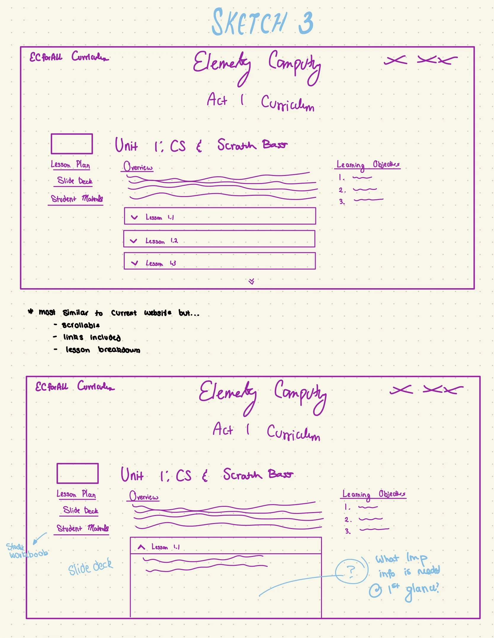
Based on the preliminary research and competitive analysis, I identified 4 main features to prioritize: individual curriculum pages, unit breakdowns, high-level unit overviews, and direct links to in-depth activity explanations. I produced 3 sketches incorporating these in different ways to present to stakeholders:

%20Lesson%201_edited.webp)
%20Unit%201%20-%20Home.webp)
%20Unit%201.webp)
%20Teaching%20Resources_edited.webp)
%20Home_edited_edited.webp)
%20Home%20(1)_edited.webp)
4 teachers were invited to the following lab meeting and the 3 wireframes were presented for feedback. The primary features they voted as most impactful to their workflow were:
1. Sticky navigation bar to jump between units (sketch 1)
2. Display 3 critical links on left column for each unit (sketch 3)
3. Summarize learning objective for each unit
They preferred Sketch 3 the most, potentially because it was the most similar to the original website that they already were familiar with.
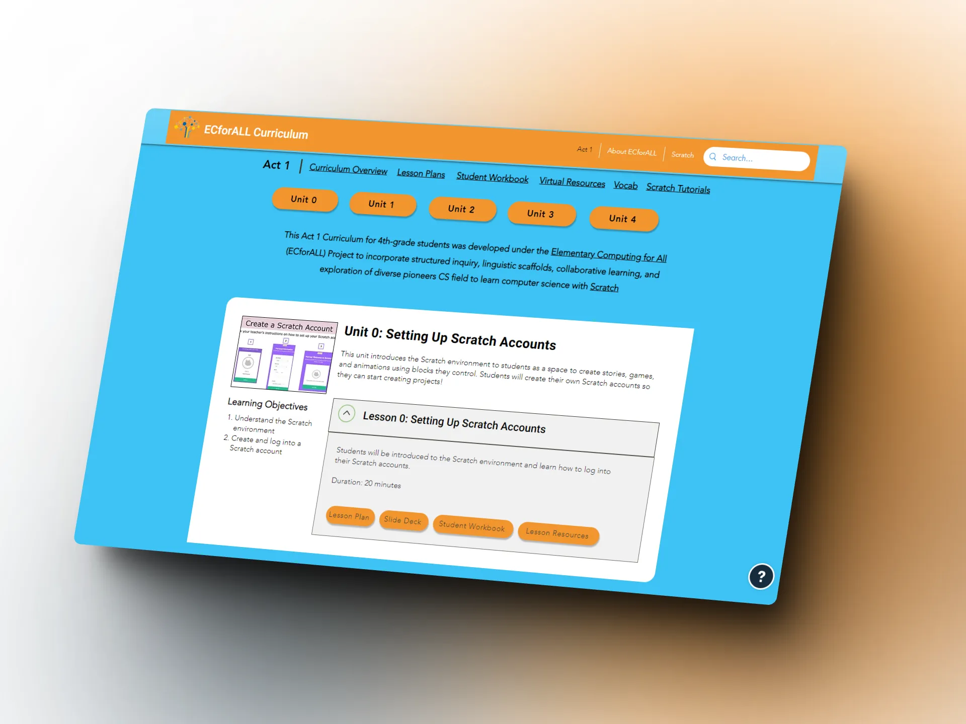
Working off their feedback, I applied edits to Sketch 3 to incorporate in critical features from the other sketches and created a high-fidelity prototype on Figma, while collaborating with a web developer for final implementation.
Color not only sets the mood, concept, and reputation for the lab but is a major factor in helping communicate information efficiently through legibility and accessibility.
.webp)
After presenting to the research team, I was informed that they preferred to
mimic the color scheme of the original Scratch interface.
I created a test website layout as a visual that I could show the research team for approval, prior to finalizing and changing the color scheme on the website with the developer.


After building the full prototype on Wix, I requested to run usability tests with 2 users. Both teachers had taught the curriculum before and were on the original panel that voted on the wireframes but had not seen any iterations since. The process was as follows:
Write, edit, and receive approval with 2 other researchers
Scheduled and ran 30 min Zoom meetings with each participant
Clean and code transcriptions to identify trends to make further improvements
All participants finished at least 4 / 5 tasks in under 15 minutes
Only minor changes were suggested, such as rewriting certain links for clarity (i.e. "Slide Deck" to "Slide Presentation") and to add a link to Scratch to the top header. Otherwise, the participants overall gave positive feedback.
"I like that things were grouped and within those, you have links so I don't have to search for anything. Everything is included here."
"I like it... it is much easier to navigate than the previous website and less overwhelming"
Visually, it's a lot easier. I feel like it's teacher and student friendly"
The entire design process took around 1 month to complete, but as part of the research team, I have been continuously maintaining and updating the website as new material is created. For example, I helped to add new links to the sticky header for users to access Spanish versions of the student workbook once they were developed by other team members in October 2022.
The curriculum is constantly being revised and improved by the curriculum developers on my research team in hopes of making a better experience for the teachers and students. I will continuously work in updating the website to ensure users are always accessing the most updated resources. If given more time, other improvements I would like to make in the future include: